
Now that I had the formatting issues resolved, I was feelin’ GOOD. I was so much happier with this more harmonious and balanced square format.
I had finally reached the stage where I could make the final files that would be submitted to the POD (Print On Demand) platform. My artwork was entirely digitally created in Adobe Illustrator. My POD platform required a PDF (Portable Document Format) file submission. This totally makes sense, as a PDF is a universal format that can be opened in any program. What’s more, the way the information is saved allows it to “look” like how you intended it to look. Have you ever opened a file whereby your computer substitutes in a different font because the one used in the file is not installed on your computer? Well, PDF was supposed to be one way to avoid that happening (if the font was properly embedded into the PDF in the first place. But I digress).
Anyhow, as I stared greedily at that light at tunnel’s end, smelling my victory nearing, I made my PDFs carefully and exactly as per POD platform specifications. Then I opened my file to make sure all the pages were in proper order, and what I found is what is shown in the example images. There was a strange mudification (not a real word) in the middle of the gradient I used in the background. So, went back to the Illustrator file, re-made PDF thinking it was a fluke, and re-opened in Acrobat to look at my PDF. And guess what? Still mud.
I played with many different variables, one of which we’ll go into detail in next post, but I was still always having the same issue. I had used gradients on practically all the pages, yet it was NOT occurring on all!
You may wonder, what’s the issue? The color shift is not too bad. But when color palette plays a huge role in the style, feel, and atmosphere of a book, it kind of IS a big deal when the vibrancy of the colors is lost.
So, what was the solution? Answer, next post!
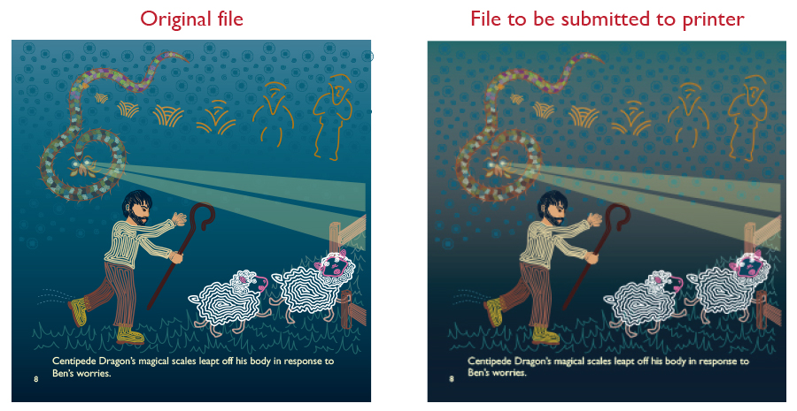
 RSS Feed
