
 After switching up the two colors and trying new combinations of them ad nauseam, I finally noticed that on pages where I used only a solid color in the background, that there didn’t end up being a color issue. So I simply tried a single, or 1-color gradient, which is one color at one percentage value on one end (e.g., 100%) and the same color at a different percentage at the other end (say 75%). And the result was successful, no more muddy gray in the midst of the gradient!
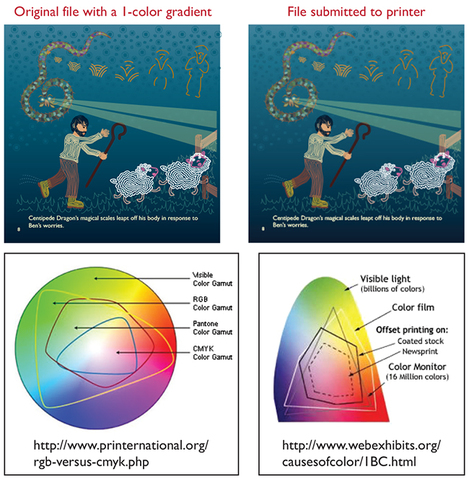
So what the heck was going on? Here’s what I understand. Color reproduction has undergone an amazing developmental history. We started, for instance with a Crayola 8-pack of crayons, before we were able to manufacture 32, and then 64 distinct colors. What we can recreate on the monitor is a color range that is far greater than what our color pigments can actually reproduce on paper. What is shown on our computer screens, the visible spectrum, represents how light truly “colors” everything it reaches, and does so in such variation depending on its strength, its proximity, any impurity in the medium through which it travels, and, what may be within its path. Not only that, two objects that are the same distance from the light source may be colored very differently from one another, depending on the angle upon which the light hits the object. And then, what color is the object itself? And THEN, is it sitting on a surface? What is the surface made of? What color is it? Our visible spectrum is thus capable of displaying to us every conceivable hue of color and color variation. With print colors, however, light is no longer the driving factor that determines color. It’s actually chemistry that creates the array of hues we can print. Here are two examples of how this visible color spectrum versus print color spectrum differs. There is a huge difference between RGB additive color, created by light emission as monitor screens do, versus CMY ink absorption on paper. This discrepancy between monitor screen color and print color is vast and problematic. What I realized was that I wasn’t always consistent in whether my file was set up as CMYK or RGB (WOW, rookie mistake!). So, that probably had a hand in my gradient woes. And likely, someone far better trained than I could’ve figured out the color combinations that would allow for printing a 2-color gradient. But this 1-color gradient seemed to do the trick, and after months of technical issues, I stuck a fork in the gradient problem. 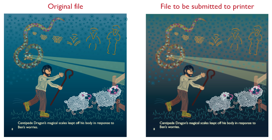 Now that I had the formatting issues resolved, I was feelin’ GOOD. I was so much happier with this more harmonious and balanced square format.
I had finally reached the stage where I could make the final files that would be submitted to the POD (Print On Demand) platform. My artwork was entirely digitally created in Adobe Illustrator. My POD platform required a PDF (Portable Document Format) file submission. This totally makes sense, as a PDF is a universal format that can be opened in any program. What’s more, the way the information is saved allows it to “look” like how you intended it to look. Have you ever opened a file whereby your computer substitutes in a different font because the one used in the file is not installed on your computer? Well, PDF was supposed to be one way to avoid that happening (if the font was properly embedded into the PDF in the first place. But I digress). Anyhow, as I stared greedily at that light at tunnel’s end, smelling my victory nearing, I made my PDFs carefully and exactly as per POD platform specifications. Then I opened my file to make sure all the pages were in proper order, and what I found is what is shown in the example images. There was a strange mudification (not a real word) in the middle of the gradient I used in the background. So, went back to the Illustrator file, re-made PDF thinking it was a fluke, and re-opened in Acrobat to look at my PDF. And guess what? Still mud. I played with many different variables, one of which we’ll go into detail in next post, but I was still always having the same issue. I had used gradients on practically all the pages, yet it was NOT occurring on all! You may wonder, what’s the issue? The color shift is not too bad. But when color palette plays a huge role in the style, feel, and atmosphere of a book, it kind of IS a big deal when the vibrancy of the colors is lost. So, what was the solution? Answer, next post! 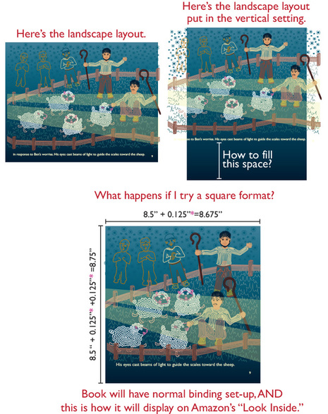 My book actually began as a vertical-oriented U.S. Letter format, but as previously mentioned, the horizontally long shape of Centipede Dragon seemed to work better in landscape orientation. But I never liked this format because of the shelving dilemma I mentioned in an earlier post: it either sticks way out of the shelf, or, if you shelve it vertically, you can’t see the spine to read the spine text.
Now faced with the added dilemma of the “Look Inside” problem, I considered my options: A) Leave it and deal with it. B) Grin and bear it, and change the format. C) Give up and cry. You’ll be proud to know I did NOT choose C. The driving force was NOT integrity to quality, rather, that I already had an uphill battle coming with marketing the book. Initially, I thought about making it vertical U.S. Letter as it had originally been laid out back in 2005. But the formatting would entail much more layout restructure. Even if I could just delete what fell off the page on the left and right edges, there would still be a blank space at the top or bottom of the page (see top row, right image). As I mindlessly stared at the list of standard formats, I focused on one in particular: 8.5” X 8.5”, or square format? Interesting. Fascinating. Not only might it solve my “Look Inside” insanity, but also, the calendar-binding conundrum, the spine text disappearing act, would take less layout re-jiggering, and most importantly, it would address the “Alice doesn’t like landscape format” contradiction. Indeed, it’s hip to be square. |
Alice Y. Chenis the author of Centipede Dragon A Benevolent Creature, the first of a series of children's picture books for ages 3-7 (and up). Archives
December 2020
|
 RSS Feed
