
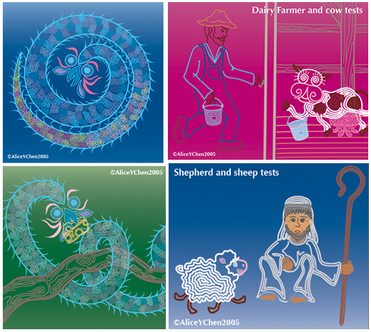
A signature of my book is its color palette, or, the collective color scheme chosen for illustrations. The feedback I have gotten about my color choices has been (all but one comment actually), fabulous…Hooray! Which is truly gratifying given the collage I present with this blog: these were the initial colors from the 2005 version of the book, which may have better suited the one review that thought my colors weren't vibrant enough.
Bold, contrasting colors supposedly capture young children’s attentions longer. So that’s where I started my color tests, having decided to gear my book to a younger audience. Color is also CRUCIAL to the overall tone of a book, as bold, bright colors are going to stimulate, while pastels tend to soothe or relax.
The style of illustration also influences color choice. Had I gone with a sketchy, less graphic style, I likely would've chosen soothing colors. Ultimately, I wanted to LIKE the colors as I'll be living with them for a LONG time.
In the end, I fell into my final color palette simply by testing numerous color combinations. That, coupled with seeing how some colors “settle” into the background while others scream “Look at ME!” influenced my final palette. And for the better, I might add!
 RSS Feed
