
After switching up the two colors and trying new combinations of them ad nauseam, I finally noticed that on pages where I used only a solid color in the background, that there didn’t end up being a color issue. So I simply tried a single, or 1-color gradient, which is one color at one percentage value on one end (e.g., 100%) and the same color at a different percentage at the other end (say 75%). And the result was successful, no more muddy gray in the midst of the gradient!
So what the heck was going on?
Here’s what I understand. Color reproduction has undergone an amazing developmental history. We started, for instance with a Crayola 8-pack of crayons, before we were able to manufacture 32, and then 64 distinct colors. What we can recreate on the monitor is a color range that is far greater than what our color pigments can actually reproduce on paper. What is shown on our computer screens, the visible spectrum, represents how light truly “colors” everything it reaches, and does so in such variation depending on its strength, its proximity, any impurity in the medium through which it travels, and, what may be within its path. Not only that, two objects that are the same distance from the light source may be colored very differently from one another, depending on the angle upon which the light hits the object. And then, what color is the object itself? And THEN, is it sitting on a surface? What is the surface made of? What color is it?
Our visible spectrum is thus capable of displaying to us every conceivable hue of color and color variation. With print colors, however, light is no longer the driving factor that determines color. It’s actually chemistry that creates the array of hues we can print.
Here are two examples of how this visible color spectrum versus print color spectrum differs. There is a huge difference between RGB additive color, created by light emission as monitor screens do, versus CMY ink absorption on paper. This discrepancy between monitor screen color and print color is vast and problematic. What I realized was that I wasn’t always consistent in whether my file was set up as CMYK or RGB (WOW, rookie mistake!). So, that probably had a hand in my gradient woes. And likely, someone far better trained than I could’ve figured out the color combinations that would allow for printing a 2-color gradient. But this 1-color gradient seemed to do the trick, and after months of technical issues, I stuck a fork in the gradient problem.
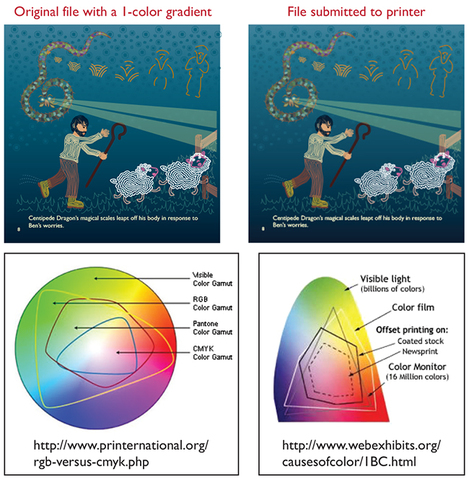
 RSS Feed
